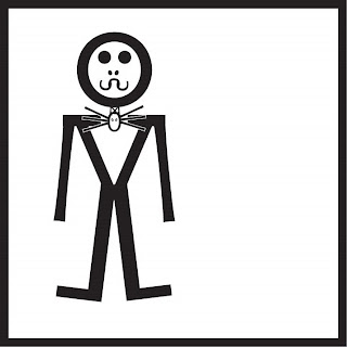
analysis:
I used three fonts to create my Jack doll: Lucinda Console Regular, Prestige Elite Std Bold, and Optima Regular. For the head I used an O in the Prestige font because it was a perfect circle. His eyes are the same; I just made the stroke size bigger so it would appear to be filled. The nose are two zeros in the prestige font with a large stroke size to appear filled. The mouth is made up of 3 Cs in the Lucinda font because I needed something curved without a serif. I just rotated the Cs to make it look like a curved mouth. The body is a V in Prestige font because his body is wider at the top than the bottom and a V is the same way. I used the Prestige font because I wanted the serifs to look like he had shoulders. The neck tie is all made out of the Lucinda font. The oval is a zero, the whisker things are Vs with 2 of the sides overlapping to look like there’s just 3 whiskers. The triangle ears are Vs and the eyes are zeros with a big stroke to look filled. I used Lucinda because I needed a sans serif font. Jack’s arms are lower case Ls in the Optima font because the Ls in the other 2 fonts had weird lines at the top of them making them look like upper case Ls, but only upside down. His legs are made of uppercase Ls in the Lucinda font because the bottom stroke that makes his foot was shorter than the Prestige font and I didn’t want Jack to have huge feet.
One of the challenges I faced when trying to create this was what font and characters to use to make his mouth. After I figured out I would use Cs, I needed to find a simple sans serif font to use.


No comments:
Post a Comment