Wednesday, July 6, 2011

week 9


Netherlands currency – J.J. Kruit

I think the design of this currency is genius. It's really easy to tell the difference between different bills, it would be difficult to counterfeit, and it just looks nice. The design of American bills are really boring. They've had the same design for way too long. I think America should redesign our currency and make it harder for people to counterfeit and easier to tell the difference between bills, like these Netherlands bills. God forbid we add some color to our lives. :P

Friday, June 10, 2011

Creative Brief


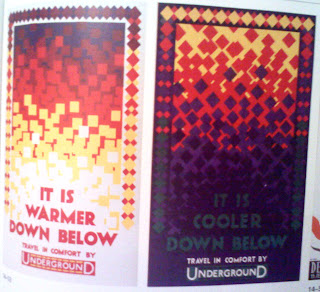
1. Identification: Poster for the London Underground by Austin Cooper from 1942.

2. Project and problem: A poster that is supposed to make people want to ride the London Underground. It is supposed to show people that riding the London Underground is a comfortable way to travel.

3. The client: Is obviously the London Underground.

4. Intended Audience: People of London, people visiting London,

5. Core message: RIde the London Underground, you will be traveling in comfort. It's cooler during summer and warmer during winter.

6. Hoped for outcome: Hoped for outcome is to get people to ride the London Underground.

7. Graphic strategy: Cooper wanted to show that during the winter it was warmer underground, so (besides the words saying "It's warmer down here") he used cool colors on the top, and warmer colors on the bottom, showing that it's warmer underground. He did the opposite for the summer poster, warm colors up top and cool colors on the bottom to show that it's cooler underground. I think it's a really good way to show the temperature change between above ground and underground.

weekly blog


London underground map.
I thought this was pretty cool because it makes finding your way through the London subway station easier. (Not that I would know by experience, unfortunately. *sad face*) Even though it's not accurate of what the London Underground looks like, it's very easy to read and helps riders get to where they're going. Being a poor college student who doesn't own a car, I am forced to ride the bus to a lot of places, and sometimes trying to read the map they have in the Rider's Guide is pretty difficult to see. They use about 3 or 4 different shades of res that look very similar. Maybe I should get a time machine and have Henry C. Beck redesign the City Link User's Guide map.....

Tuesday, May 31, 2011

Stationary set

Okay, so these uploaded backwards...

Anyways, the font that is on these is NOT the font I'm going to be using, it's just a placement font because the ones I am using are on a different computer. *grumble* Also, my logo hasn't been critiqued yet, so things might change after that's been critiqued.

back of the envelope
front of the envelope
back of business card
front of business car

letterhead

Saturday, May 28, 2011

Logo for FrankenFashion


I didn't give him a face because trying to make frankenstein look happy just didn't look right.

Thursday, May 19, 2011

Typeface:The Movie

Located in Two Rivers, Wisconsin is a wood type museum. What's different about this museum is that it's in a factory, and nothing is behind glass windows, you can touch everything. It was really interesting to see how the "old" (the people in the movie said it, not me!) people made wood type. They would use a saw and cut the wood, and use another machine to cut out the letters, but they smoothed it out by hand. There were letters of every size and tons of different typefaces. They put a LOT of care into making the letters for the letter presses.
In the movie they showed a lot of letter pressing, it was really awesome to see how it was done, a lot more difficult than pushing buttons to tell the jet ink printer what to do. It would be really fun to be able to do letter pressing. (Let's get one for RMU!) It was really refreshing to see that some people still appreciate letter pressing, and people still use letter presses. It would be really nice to get away from the computers for a while and do some letter press printing.

Wednesday, May 18, 2011

Assignment TWO–Product and Company Development Questions

  • Company Name–FrankenFashion
  • Product Produced–dress up monster plush dolls
  • Price range–Doll (comes with 2 outfits) : $15, one outfit: $2, 6 outfit pack: $10
  • The Market–young children, more specifically girls
  • Who buys it?–Parents, grandparent, aunts, uncles, older siblings
  • Color schemes–olive (Frankenstein-ish looking) green, light purple, maybe a touch a light pink.
  • Typography–decorative, grungy monster-ish looking, but kind of girly at the same time.
  • Logo that appeals to both market AND purchaser–Illustrated, so kids will like it, not grungy or gross so parents would approve. It will look friendly and happy.
  • Logo Communication–Cute. Fun.
  • Words to describe product–FuNkY, fun, cute.
  • Competitors–Barbie, Bratz, Monster High